widget_config.json file
The widget_config.json file is a crucial component for configuring and customizing widgets in your application. This article aims to provide clearer instructions on updating the widgetDetails and settingsSchema sections of the widget_config.json file.
widgetDetails
The widgetDetails section allows you to specify general information about the widget, such as its "title" and "description".
-
"title": Provide a descriptive title for the widget you are creating. Make sure that it is concise and accurately represents the purpose of the widget. -
"description": Write a comprehensive description that explains the functionality and features of your widget. Be clear and concise, and highlight the unique aspects that make your widget stand out. -
"type": Describes the usage type of a widgets, for example:- Platform - widgets like navigation, GA, sidenav. Anything that cannot be placed on the dashboard. (widgetType === 0)
- Dashboard - widgets for dashboards only, like informers, charts, etc. (widgetType === 1)
- Universal - widgets both for platform and dashboards. (widgetType === 2)
"widgetDetails": {
    "title": "Data Table",
    "type": "0",
    "description": "Displays records in a grid view with actions to search, sort, customize the view, and filter",
    "innerTags": [],
    "tags": []
  }
settingsSchema
The settingsSchema section defines the configuration options or settings available for your widget that can be changed to customize the behavior of the widget.
The settingsSchema is an automatic React form generation based on JSON Schema.
jsonSchema
The jsonSchema property defines the structure of the settings that can be customized. It includes the type of data, required fields, and properties of the settings.
uiSchema
The uiSchema property defines the layout and appearance of the form generated by the settings schema. It allows you to customize the form's appearance, such as the order of fields, widgets used for input, and additional options.
extraErrors
The extraErrors property allows you to define additional error messages that can be displayed when the user enters invalid data in the settings form.
title
The title property is the title of the settings form that will be displayed to the user when configuring the widget. It's not required but recommended to provide a clear title that describes the purpose of the settings.
formType
The formType property defines the behavior of the settings form. It can have three values: json, customized, and dedicated.
json: This is the default behavior. It renders the form according to the JSON schema provided and does not load WidgetSettings. This mode is likely used for standard forms where no customization beyond the JSON schema is needed.customized: Despite loading WidgetSettings, it uses specifically wlabel's controls to save the form data. This could be intended for forms that require both standard configurations from the JSON schema and some level of customization like loading something to select.dedicated: Load WidgetSettings which should contain controls to save the form. This mode is used for legacy forms.
{
  "settingsSchema": {
    "title": "Datagrid Preferences",
    "uiSchema": {
      "ui:order": ["title", "titleTooltip", "selectable"],
      "ui:options": {},
      "title": {
        "ui:widget": "InputWidget",
        "ui:options": {}
      },
      "titleTooltip": {
        "ui:widget": "InputWidget",
        "ui:options": {}
      },
      "selectable": {
        "ui:widget": "CheckboxWidget",
        "ui:options": {}
      }
    },
    "jsonSchema": {
      "type": "object",
      "required": ["dataProvider", "pagination", "consistency"],
      "properties": {
        "title": {
          "type": "string",
          "title": "Title"
        },
        "titleTooltip": {
          "type": "string",
          "title": "Tooltip"
        },
        "selectable": {
          "type": "boolean",
          "title": "Is Selectable"
        }
      }
    },
    "extraErrors": {},
    "formType": "json"
  }
}
Details
UI example for describing settingsSchema
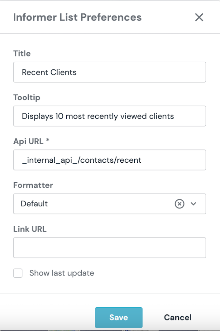
More about react-jsonschema-form you can read and try it in the live playground here.