Widget Configuration Guidelines
Introduction
This guide will walk you through the essential properties in the widget-config.json file, where you can customize all the settings you need.
Widget Details
Widgets play a crucial role in providing information and enhancing user experience. To make widgets easily retrievable in the Widget Store, it's important to include specific details such as the image, vendor name, description, and tags for categorization.
Example: KPI Tracker Widget
Let's see the details of the KPI Tracker widget as an example.
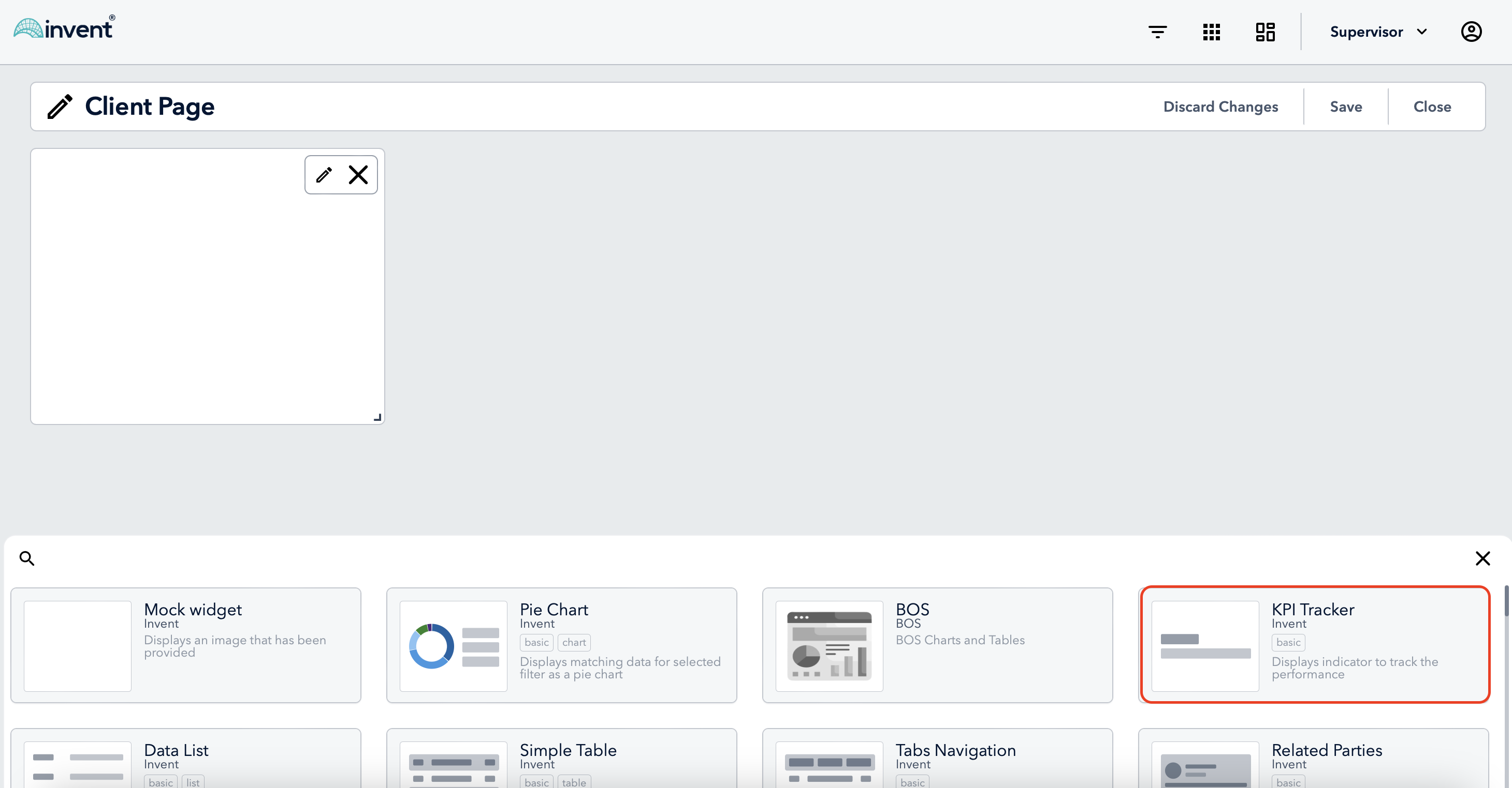
widget-config.json File
In the widget-config.json file, the widgetDetails section is where you specify general information about the widget:
{
  "id": 452,
  "port": 5452,
  "name": "CORE_BasicInformer",
  "issuer": "Invent",
  "domain": "info",
}

"widgetDetails": {
    "title": "KPI Tracker",
    "type": "Informer",
    "description": "Displays indicators to track performance",
    "innerTags": [],
    "tags": ["Basic"]
}
Here's a breakdown of the properties that will be displayed in the preview section of the Widget Store:
"title": A concise and accurate title representing the purpose of the widget."description": A comprehensive description explaining the functionality and features of the widget."type": Describes the widget type. For example, "Informer" or "Chart"."issuer": The vendor name responsible for the widget, in this case, "Invent".
| Field | Requirement | Max Length |
|---|---|---|
| Title | Required | 25 chars |
| Vendor Name | Required | 25 chars |
| Tags | Optional, Multiple Values | Not limited |
| Description | Required | 100 chars |
Note that spaces are counted as a characters.
NOTE: It is encouraged to add the following properties to tags: CompanyName and WidgetType.i.e.:
"tags": ["Invent", "Basic"]
List of avalaible tags
| Tags | Tags |
|---|---|
| 401 (k) implementation | e-signature |
| account | financial planning |
| account aggregation | form |
| account group | forms management |
| advice engagement | fp |
| advisory fee billing | fp group |
| all in one | household |
| basic | insurance data/analytics |
| behavior assessments | investment data/analytics |
| bids | kpi |
| blotter | list |
| branch location | managed service providers |
| business intelligence/metrics | markets |
| business unit | performance reporting |
| chart | portfolio management |
| client data gathering | prices |
| client file sharing | risk tolerance |
| client meeting support | sales enablement |
| client portal | schedule apps |
| communications archiving | specialized planning |
| compliance | stress testing |
| contact | table |
| contact group | trade |
| crm | workflow |
| digital marketing | workflow support |
| digital onboarding | wizard |
| document management | |
| ----------------------------- | ------------------------- |
Preview Image
The image of the widget is stored in the preview src/widgetName/widget-name-settings.jsx.
The preview image should be an SVG with the following dimensions:
- Height: 64px
- Width: 88px
Below is an example component of the BasicInformer widget, with the title: KPI Tracker:
import React, { SVGProps } from 'react'
import { Svg } from './styled'

function BasicInformerPreview(props: SVGProps<SVGSVGElement>) {
  return (
    <Svg
      width='88'
      height='64'
      viewBox='0 0 88 64'
      xmlns='http://www.w3.org/2000/svg'
      {...props}
    >
      <rect y='20' width='37' height='10' rx='1' />
      <rect y='34' width='88' height='10' rx='1' />
    </Svg>
  )
}

export default BasicInformerPreview
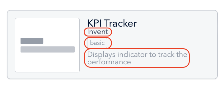
CAUTION: In case the title of the widget already contains the vendor name, then you can skip adding the vendor name to the tags.
Feel free to customize this component to visually represent your widget in the Widget Preview section.