List of platform widgets
Widgets are grouped by domain and their placement.
| domain | placement | type |
|---|---|---|
| navigation | side-nav | ui |
| navigation | start | logic |
| info | notification | ui |
| menu | main-menu | ui |
| errors | dashboard-widget | ui |
| errors | page-route | ui |
| errors | dashboard | ui |
| dashboard | dashboard | ui |
| dashboard | header | ui |
| access | composer | logic |
| access | dashboard | logic |
| get-user-info | info | logic |
| login | login | ui |
| themes | info | logic |
Type
ui- displayed in the interfacelogic- not displayed in the interface, a set of actions
Domain navigation
Responsibility for navigation within the application.
side-nav ui
Side-nav provide access to destinations in your app.
Usage
Each destination is represented by an icon and an optional text label. When a navigation icon is tapped, the user is taken to the navigation destination associated with that icon or main-menu widget opening. For example, сlicking on home redirects to the home page.
UI Placement
The position of the widget is on the left side of the screen, but it is not mandatory.The widget have a fixed position and and is always displayed on the screen.
Implementation
type ComponentPropsT = {
  apiUrl: string;
  toggleMenu: () => void; // handle toggle MainMenu
  isOpenMenu: Maybe<boolean>; // state of opened MainMenu
  basicSections: SectionT[];
};
start logic
The Platform Widget is responsible for redirecting the user inside the application after login.
Usage
Redirect to the start dashboard or a any page which you want to get to after logging in.
Domain menu
main-menu ui
Main-menu provide access to destinations and app functionality.
Usage
Can contain destinations, application settings, global search, and any information that you need to quickly access from anywhere in the application.
UI Placement
Opens by clicking on side-nav.
Located next to the main-menu and on top of the application.
Implementation
type ComponentPropsT = {
  apiUrl: string;
  customizationUrl: string;
  isOpen: Maybe<boolean>;
  onClose: () => void;
};
Domain info
The information part of the app
notification ui
Notification provide brief messages about app processes.
Usage
Notifications inform users of a process that an app has performed or will perform. They appear temporarily. They shouldn’t interrupt the user experience, and they don’t require user input to disappear. Sometimes notifications have a cross icon to close.
Parameters for castiomization:
- color
- style
- type of notification ('info', 'success', 'error', 'warning')
- time after which the notification will disappear from the screen
- position on the screen (top-right, top-center, top-left, bottom-right, bottom-center, bottom-left)
UI Placement
On top of the application and at the bottom of the screen by default or any of the available positions:
- top-right
- top-center
- top-left
- bottom-right
- bottom-center
- bottom-left
Implementation
Available in all widgets.
Will be triggered by calling showNotification, it propagated into Widget as prop.
type ShowNotificationWidgetPropsT = {
  type: "info" | "error" | "warning" | "success";
  content: JSX.Element; // message of notification
  onClose?: () => void; // close a toast
  refreshHandler?: () => void; // callback function for call action again
};

const ShowNotificationWidget = ({
  onClose,
  type,
}: ShowNotificationWidgetPropsT) => {
  return (
    <div>
      <Icon type={type} />
      {content}
      <button onClick={onClose}>X</button>
    </div>
  );
};
Domain errors
Error handling and UI display of error state.
dashboard-widget ui
Error state for widget
Usage
The screen that will be displayed instead of the widget if an error occurs.
Could contain any message.
UI Placement
Inside widget
Implementation
type ComponentPropsT = Record<string, unknown>; // Should follow by your error handling contract.
Example:
const ErrorWidgetState = ({ status, message, body }) => {
  return (
    <div>
      <h3>{status}</h3>
      <p>{message}</p>
      <span>{body.toString()}</span>
    </div>
  );
};
Example of usage:
import React from "react";

const VendorWidget = ({errorStateComponent: ErrorStateComponents, httpClient, apiUrl}) => {
 const { data, status, error } = useQuery<IAccount[], {message: string; body: Record<string, string>}>(['vendorWidget', apiUrl], ()=> {
   return httpClient(`${apiUrl}/accounts`);
 })

 if (status > 400) return <ErrorStateComponents status={status} {...error} />

 return <div>{data.map((account) => ...)}</div>
}
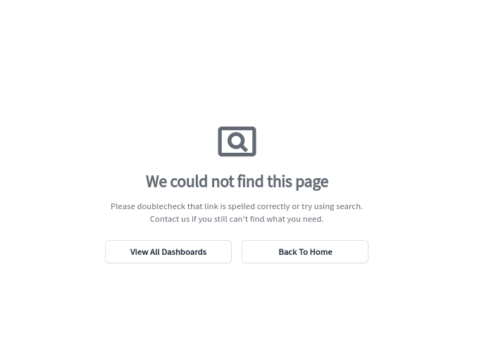
page-route ui
Custom error state for unknown destination
Usage
Displays an error if the path does not exist
UI Placement
Main screen
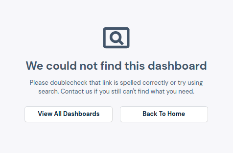
dashboard ui
Custom error state for non existed dashboards
Usage
Showed if fe-be server will send 404 HTTP reponse /dashboards/{dashboardId}
UI Placement
Dashboard
Domain dashboard
dashboard ui
Replacing the standard dashboard sheet with a custom one
UI Placement
Dashboard
Implementation
interface IUseDashboardsPostMutation {
  onError?: any;
  onSuccess?: any;
}

type ComponentPropsT = {
  mainMenuSections: SectionT[];
  onCreateDashboard: ({ dashboardData }: any) => void;
  useDashboardsPostMutation(
    options?: IUseDashboardsPostMutation | undefined
  ): UseMutationResult<
    | {
        id: string;
      }
    | {
        result: IServerDashboard;
      },
    any,
    IDashboard,
    unknown
  >;
  previewDashboards?: PreviewDashboardListT;
  themeName?: string;
};
header ui
Replacing the standard dashboard header with a custom one
UI Placement
Dasboard header
Implementation
type ComponentPropsT = {
  apiUrl: string;
  toggleMenu: () => void; // handle toggle MainMenu
  isOpenMenu: Maybe<boolean>; // state of opened MainMenu
  basicSections: SectionT[];
  customizationUrl: string;
};
Domain access
Responsibility for accessing certain parts of the application.
composer logic
A wrapper is a tool which wraps composer at /dasboard/dashboard-name/compose
Usage
That checks the user's role and redirects if there are not enough rights.
Implementation
<PlatformWidget
  domain="access"
  placement="composer"
  fallback={accessComposerFallback}
>
  <ComposerGrid />
</PlatformWidget>
import React, { useEffect } from "react";

const AccessComposer = ({ children }) => {
  const userRole = getUserRole();

  useEffect(() => {
    if (!userRole || !hasToComposerAccess(userRole)) {
      history.push("/401");
    }
  }, [userRole]);

  return <>{children}</>;
};
dashboard logic
A wrapper is a tool which wraps dashboard at /dasboard/dashboard-name
Usage
That checks the user's role and redirects if there are not enough rights.
Implementation
<PlatformWidget
  domain="access"
  placement="dashboard"
  fallback={accessDashboardFallback}
>
  <Dashboard />
</PlatformWidget>
import React, { useEffect } from "react";
import { showNotification } from "@invent/wl-ui-kit";

const AccessDashboard = ({ children, dashboardMeta }) => {
  const userRole = getUserRole();

  useEffect(() => {
    if (!userRole || !hasToDashboardPermission(userRole, dashboardMeta)) {
      history.push("/dashboard/home");
      showNotification("No access");
    }
  }, [userRole, dashboardMeta]);

  return children;
};
Domain get-user-info
info logic
User info in application state
Usage
Got information about the user and saving to the application state
Implementation
import React, { useEffect } from "react";
import { useQuery } from "react-query";

const userProfileSelector = (state: ISharedState) => state.userProfileSelector;

const GetUserInfo = ({
  apiUrl,
  httpClient,
  useShareValue,
  useSelectSharedValue,
}) => {
  const shareValue = useShareValue();
  const userProfile = useSelectSharedValue(userProfileSelector);
  useQuery<T, E>(
    ["userProfile", apiUrl],
    () => {
      return httpClient(`${apiUrl}/user-profile`);
    },
    {
      onSuccess: ({ data }) => {
        shareValue(["userProfile"], data);
      },
      keepPreviousData: true,
      refetchOnReconnect: false,
      refetchOnWindowFocus: false,
    }
  );

  return null;
};
Domain login
login ui
Custom login screen on /login
Usage
Enter your password or redirect to SSO
UI Placement
Main screen
Implementation
type ComponentPropsT = {
  signinRedirect: () => void;
};
Example:
import React, { useEffect } from "react";

const LoginScreen = ({ signinRedirect }) => {
  useEffect(() => {
    signinRedirect?.();
  }, [signinRedirect]);

  return null;
};
Domain themes
info
Theme settings rules
Usage
Initializing a theme and its settings
Implementation
type ComponentPropsT = {
  setTheme: (themeName: string) => Action<IChangeThemeRequest, {}>;
  currentThemeName?: string;
  isThemeLoading: boolean;
  loadTheme: (themeName: string) => Action<...>;
  themeIsExist: boolean;
};
Example:
import React, { useEffect } from "react";

const ThemeInitSetter = ({ setTheme }) => {
  useEffect(() => {
    const themeName = localStorage.getItem("currentThemeName");
    if (!themeName) {
      localStorage.setItem("currentThemeName", "VENDOR-default");
    }
    setTheme(themeName ?? "VENDOR-default");
  }, [setTheme]);

  return null;
};