Widget Configuration
Everything about a widget is configured in its widget-config.json file — also referred to as the widget settings — the store-listing details that make it discoverable, the settings form users fill in, its layout constraints, and its context rules. This page covers the widget details and settings parts; see Context for contextRules and Layout & Testing for layout constraints.
Widget details
The widgetDetails section holds the information shown in the Widget Store and Micro App Library — what makes your widget discoverable and recognizable.
{
  "id": 452,
  "port": 5452,
  "name": "CORE_BasicInformer",
  "issuer": "Invent",
  "widgetDetails": {
    "title": "KPI Tracker",
    "type": "Informer",
    "description": "Displays indicators to track performance",
    "innerTags": [],
    "tags": ["Invent", "Basic"]
  }
}
title— a concise, accurate name for the widget.description— what the widget does and its key features.type— the usage type shown in the store (e.g. "Informer", "Chart"). This is distinct fromwidgetType(0platform /1dashboard /2universal), which controls where the widget can be placed.issuer— the vendor name responsible for the widget.tags— categories for store search. It's encouraged to include the company name and widget type, e.g.["Invent", "Basic"]. If the title already contains the vendor name, you can skip repeating it in tags.
Store-listing fields have length limits:
| Field | Requirement | Max length |
|---|---|---|
| Title | Required | 25 chars |
| Vendor name | Required | 25 chars |
| Tags | Optional, multiple | Not limited |
| Description | Required | 100 chars |
Note: spaces count as characters.
Available store tags
| Tags | Tags |
|---|---|
| 401 (k) implementation | e-signature |
| account | financial planning |
| account aggregation | form |
| account group | forms management |
| advice engagement | fp |
| advisory fee billing | fp group |
| all in one | household |
| basic | insurance data/analytics |
| behavior assessments | investment data/analytics |
| bids | kpi |
| blotter | list |
| branch location | managed service providers |
| business intelligence/metrics | markets |
| business unit | performance reporting |
| chart | portfolio management |
| client data gathering | prices |
| client file sharing | risk tolerance |
| client meeting support | sales enablement |
| client portal | schedule apps |
| communications archiving | specialized planning |
| compliance | stress testing |
| contact | table |
| contact group | trade |
| crm | workflow |
| digital marketing | workflow support |
| digital onboarding | wizard |
| document management |
For the complete widget-config.json field spec — id, port, name, domain, placement, widgetType, layout, url, version — see Widget Metadata in the Manual.
Widget settings
Most widgets expose a settings form so each instance on a dashboard can be configured independently — its title, data source, refresh interval, display options, and so on. Settings are declared once by the widget and rendered by the platform; the saved values are then handed back to the widget at runtime.
The values you set in widget-config.json are the defaults for every new instance of the widget. For example, if you set the title to "Title", then every time the widget is added to a dashboard its title starts out as "Title". From there the value is editable per instance: when someone changes it from the Composer view, that change applies only to that specific instance on that specific dashboard — it doesn't affect the default or any other instance. So the config value seeds each instance as it's added, and each placed instance then carries its own overrides.
Note that changing a widget's settings on a dashboard updates that widget's settings for all users of that dashboard — the exception being a custom dashboard, where the change is scoped to your own custom view.
Where users configure settings
When a user adds or edits a widget on a dashboard, the platform renders the widget's settings panel in the Dashboard Composer (Host application). The user fills in the form and saves; the values are stored per widget instance.
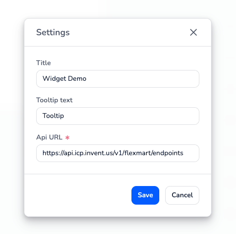
How settings are defined
Settings are described by a settingsSchema in widget-config.json, built on react-jsonschema-form. It has a few parts:
jsonSchema— defines the fields: their types, which are required, and validation.uiSchema— controls how the form looks: field order, which input widget to use, and options.extraErrors— additional custom error messages for invalid input.title— the heading shown above the settings form.formType— how the form is rendered:
formType | What it means |
|---|---|
json | The form is auto-generated from the JSON Schema and no custom settings component is loaded (most common) |
customized | A custom settings component is loaded, but the platform's controls save the data — for forms that need some custom UI (e.g. a dynamic select) on top of the schema |
dedicated | A fully custom settings component that handles its own saving (used for legacy forms) |
The widget's settings module renders the form. The template's default (json) settings component hands the settingsSchema straight to JsonForm, which builds the form for you:
import React from 'react';
import { JsonForm } from '@invent/json-settings';
import type { JsonFormPropsT } from '@invent/json-settings';
import { ICloudProps } from '@invent/shared-types';
import { settingsSchema } from '../../widget-config.json';

export interface IFullTestSettingsProps extends ICloudProps {
  apiUrl?: string;
}

export default ({
  jsonSchemaProps
}: IFullTestSettingsProps & { jsonSchemaProps: JsonFormPropsT }) => {
  return (
    <JsonForm
      {...jsonSchemaProps}
      formData={jsonSchemaProps.formData}
      schema={settingsSchema as any}
    />
  );
};
A complete settingsSchema — a few fields with a default and validation:
{
  "settingsSchema": {
    "title": "KPI Tracker Settings",
    "jsonSchema": {
      "type": "object",
      "required": ["apiUrl"],
      "properties": {
        "title": {
          "type": "string",
          "title": "Widget Title",
          "default": "KPI Tracker"
        },
        "apiUrl": {
          "type": "string",
          "title": "API URL",
          "pattern": "^https?://.*"
        },
        "refreshInterval": {
          "type": "number",
          "title": "Refresh Interval (seconds)",
          "default": 30,
          "minimum": 10,
          "maximum": 300
        }
      }
    },
    "uiSchema": {
      "ui:order": ["title", "apiUrl", "refreshInterval"],
      "refreshInterval": {
        "ui:widget": "InputWidget",
        "ui:options": { "inputType": "number" }
      }
    },
    "extraErrors": {},
    "formType": "json"
  }
}
How settings reach the widget
Saved settings are passed into the widget as individual props (e.g. title, titleTooltip, apiUrl). The widget reads them directly and re-renders when they change — there's no separate "read settings" API to call.
Preview image
The widget's preview is a small 88×64 SVG shown in the Micro App Library when users add the widget to a dashboard. See Build Setup → Implementing Widget Preview in the Reference for the preview component and image options.
Where to go next
- Build a settings form → Build Setup → Creating Widget Settings (Reference)
- Full
widget-config.jsonfield spec → Widget Metadata (Manual) - Context rules → Context
- Type the props your settings produce → the widget's
ICloudPropsplatform contract (see thewidget-platform-propsskill)