Configuration
This section covers configuring your widget's metadata, appearance, settings, and preview functionality. Proper configuration ensures your widget integrates seamlessly with the platform and provides users with a flexible, customizable experience.
Table of Contents
- Configuring Widget Metadata
- Using Theming and Styling
- Creating Widget Settings
- Implementing Widget Preview
Configuring Widget Metadata
Reference:
Note: This configuration is already set up during the 'Run Setup Wizard' step described in Section 2.
Basic Widget Configuration
widget-config.json:
{
  "id": 210,
  "port": 5210,
  "name": "ACME_KpiTracker",
  "widgetType": 1,
  "vendorPrefix": "acme",
  "tenentSlug": "acme",
  "exposes": {
    "./Widget": "./src/widget/widget",
    "./WidgetSettings": "./src/widget/widget-settings",
    "./WidgetPreview": "./src/widget-preview/widget-preview"
  },
  "widgetDetails": {
    "title": "KPI Tracker",
    "type": "Informer",
    "description": "Displays key performance indicators with real-time updates and third-party integrations",
    "issuer": "ACME Corporation",
    "innerTags": [],
    "tags": ["Analytics", "Dashboard", "KPI", "Real-time"]
  },
  "layout": {
    "minW": 5,
    "maxW": 24,
    "minH": 5,
    "maxH": 12
  },
  "settingsSchema": {
    "title": "KPI Tracker Settings",
    "uiSchema": {
      "ui:order": [
        "title",
        "titleTooltip",
        "apiUrl",
        "refreshInterval",
        "showTrend",
        "enableNotifications"
      ],
      "title": {
        "ui:widget": "InputWidget",
        "ui:options": {}
      },
      "titleTooltip": {
        "ui:widget": "InputWidget",
        "ui:options": {}
      },
      "apiUrl": {
        "ui:widget": "InputWidget",
        "ui:options": {}
      },
      "refreshInterval": {
        "ui:widget": "InputWidget",
        "ui:options": {
          "inputType": "number"
        }
      },
      "showTrend": {
        "ui:widget": "CheckboxWidget",
        "ui:options": {}
      },
      "enableNotifications": {
        "ui:widget": "CheckboxWidget",
        "ui:options": {}
      }
    },
    "jsonSchema": {
      "type": "object",
      "required": ["apiUrl"],
      "properties": {
        "title": {
          "type": "string",
          "title": "Widget Title",
          "default": "KPI Tracker"
        },
        "titleTooltip": {
          "type": "string",
          "title": "Title Tooltip"
        },
        "apiUrl": {
          "type": "string",
          "title": "API URL",
          "default": "_internal_api_"
        },
        "refreshInterval": {
          "type": "number",
          "title": "Refresh Interval (seconds)",
          "default": 30,
          "minimum": 10,
          "maximum": 300
        },
        "showTrend": {
          "type": "boolean",
          "title": "Show Trend Indicators",
          "default": true
        },
        "enableNotifications": {
          "type": "boolean",
          "title": "Enable Notifications",
          "default": false
        }
      }
    },
    "extraErrors": {},
    "formType": "json"
  }
}
Widget Types
Reference: Widget Store Migrations
enum WidgetType {
  Platform = 0, // Navigation/toolbar widgets
  Dashboard = 1, // Dashboard widgets
  Universal = 2, // Can be both
}
Preview Image
Create a preview image at public/preview.svg:
- Format: SVG
- Dimensions: 88x64 pixels
- Purpose: Displays in Micro App Library
Context Rules
Reference: Widget Metadata
Context rules determine when widgets can be added to a dashboard based on URL query parameters. These rules control widget availability in the Micro App Library menu within the Dashboard Composer (Host application).
Context Rule Types
none - Widget doesn't depend on query parameters (default behavior)
{
  "contextRules": {
    "type": "none"
  }
}
Widget appears in Micro App Library regardless of URL parameters.
dynamic - Widget appears if any of the specified keys are present OR if none are present
{
  "contextRules": {
    "type": "dynamic",
    "keys": ["contactId", "branchId"]
  }
}
Widget appears when:
- URL contains
/dashboard?contactId=123, OR - URL contains
/dashboard?branchId=456, OR - URL has no query parameters (
/dashboard)
strict - Widget appears only if all specified keys are present
{
  "contextRules": {
    "type": "strict",
    "keys": ["contactId"]
  }
}
Widget appears only when URL contains /dashboard?contactId=123
Regular Expressions
For flexible pattern matching, use regular expressions in keys:
{
  "contextRules": {
    "type": "strict",
    "keys": ["/^phone/i"]
  }
}
Matches URLs like:
/dashboard?phoneNumber=555-1234/dashboard?phoneNum=555-1234/dashboard?phoneUser=john
Advanced Example
{
  "contextRules": {
    "type": "dynamic",
    "keys": ["accountId", "userId", "/^contact/i"]
  }
}
Widget appears when URL contains accountId, userId, any parameter starting with "contact" (case-insensitive), or no parameters.
Using Theming and Styling
Reference:
Theme Structure
The platform provides themes with:
- ColorPalette: primary, secondary, tertiary, background, surface, danger, warning, success
- FontsT: primary and secondary fonts with sources
- sizeUnit: Base spacing unit (typically 4px)
- borderRadius: Default border radius
- chartColors: Array of colors for charts
- typography: Typography definitions (Heading1, Heading2, Body1, etc.)
Using useTheme Hook
import { useTheme } from "styled-components";
import type { IThemeProps } from "@invent/shared-types";

const MyComponent = () => {
  const theme = useTheme();

  // Access theme properties
  const primaryColor = theme.colors.primary;
  const sizeUnit = theme.sizeUnit;

  return <div>Theme applied</div>;
};
Theme Utility Functions
Import from @invent/wl-ui-kit:
import {
  getColor,
  getColorShade,
  getChartColor,
  getGradient,
  getSizeUnit,
  getSizeBy,
  getBorderThickness,
  getFontFamily,
  getTypography,
  injectFontFaces,
  getElevation,
  getWidgetShadowOptions,
  getThemeProp,
  getPropOrElse,
  ifPropExist,
  getHintColor,
  getMixinFromTheme,
} from "@invent/wl-ui-kit";
Color Utilities
// Basic color
color: ${getColor('primary')}; // Returns: rgb(19, 183, 209)

// Color with opacity shade
color: ${getColor('primary', 'mediumEmphasis')};
// Returns: color-mix(in srgb, rgb(19, 183, 209) 72%, rgb(255, 255, 255))

// RGB color with alpha
color: ${getColorShade('primary', 'mediumEmphasis')};
// Returns: rgb(19 183 209 / 0.72)

// Chart color by index
background-color: ${getChartColor(0)}; // First chart color
background-color: ${getChartColor(1)}; // Second chart color

// Gradient
background: linear-gradient(${getGradient('primary', [
  { opacity: 0, gradientSlicePercent: 0 },
  { opacity: 1, gradientSlicePercent: 100 }
])}); // Returns: rgb(19 183 209 / 0) 0%, rgb(19 183 209 / 1) 100%

// Hint/status colors
color: ${getHintColor('success')}; // Success color with high emphasis
color: ${getHintColor('error')};   // Error color with high emphasis
Size Utilities
// Base size unit
line-height: ${getSizeUnit}; // Returns: 4

// Size with multiplier
padding: ${getSizeBy(2)}; // Returns: 8px (4 * 2)
margin: ${getSizeBy(4)};  // Returns: 16px (4 * 4)

// Size with modifier (small, medium, large)
padding: ${getSizeBy(2, 'large')}; // Returns: 11px (4 * 2 * 1.33)
margin: ${getSizeBy(3, 'small')};  // Returns: 10px (4 * 3 * 0.83)

// Border thickness
border-width: ${getBorderThickness()}; // Theme-based thickness
Typography Utilities
// Font family
font-family: ${getFontFamily('primary')}; // Returns: 'DM Sans, sans-serif'
font-family: ${getFontFamily('secondary')}; // Secondary font

// Typography preset (applies fontSize, fontWeight, lineHeight)
${getTypography('Heading1')}
${getTypography('Heading2')}
${getTypography('Body1')}
${getTypography('Caption')}
${getTypography('ButtonText')}

// Inject font faces
${injectFontFaces('/assets')} // Generates @font-face CSS
Elevation and Shadows
// Elevation (0, 1, 2, 4, 8, 16)
box-shadow: ${getElevation(0)}; // No shadow
box-shadow: ${getElevation(1)}; // Returns: 0px 1px 1px rgb(24 31 36 / 0.06)
box-shadow: ${getElevation(2)}; // Returns: 0px 2px 2px rgb(24 31 36 / 0.06)
box-shadow: ${getElevation(8)}; // Returns: 0px 8px 16px rgb(24 31 36 / 0.12)

// Widget shadow
box-shadow: ${getWidgetShadowOptions}; // Theme-defined widget shadow or 'none'
Theme Property Access
// Direct theme property
border-radius: ${getThemeProp('borderRadius')}px; // Returns: 3px
width: ${getThemeProp('sizeUnit')}px; // Returns: 4px

// Theme prop with fallback
${getThemePropOrElse(['customProp'], 'defaultValue')}
${getThemePropOrElse(['nested', 'property'], '10px')}

// Component prop with fallback
letter-spacing: ${getPropOrElse(['letterSpacing'], 0.08)}px;

// Conditional prop
margin-bottom: ${ifPropExist(['disabled'], '6px')};
display: ${ifPropExist(['hidden'], 'none')};

// Custom theme mixin
${getMixinFromTheme('customMixin')} // Returns CSS from theme
Complete Styled Component Example
import React from "react";
import styled from "styled-components";
import {
  getColor,
  getColorShade,
  getSizeBy,
  getSizeUnit,
  getThemeProp,
  getPropOrElse,
  ifPropExist,
  getElevation,
  getFontFamily,
  getTypography,
  getChartColor,
  getBorderThickness,
  getHintColor,
} from "@invent/wl-ui-kit";

interface ThemedCardProps {
  variant?: "primary" | "secondary";
  elevation?: 0 | 1 | 2 | 4 | 8 | 16;
  disabled?: boolean;
  status?: "success" | "warning" | "error" | "info";
}

const ThemedCard = styled.div<ThemedCardProps>`
  /* Layout */
  padding: ${getSizeBy(3)};
  margin-bottom: ${getSizeBy(2)};
  border-radius: ${getThemeProp("borderRadius")}px;

  /* Colors */
  background-color: ${({ variant }) =>
    variant === "secondary" ? getColor("secondary") : getColor("surface")};
  color: ${getColor("onSurface")};
  border: ${getBorderThickness()} solid ${getColorShade(
      "primary",
      "lowEmphasis"
    )};

  /* Typography */
  font-family: ${getFontFamily("primary")};
  ${getTypography("Body1")};

  /* Elevation */
  box-shadow: ${({ elevation = 1 }) => getElevation(elevation)};

  /* Status color */
  ${({ status }) =>
    status &&
    `
    border-left: 4px solid ${getHintColor(status)};
  `}

  /* Disabled state */
  ${({ disabled }) =>
    disabled &&
    `
    opacity: 0.5;
    pointer-events: none;
    margin-bottom: ${ifPropExist(["disabled"], "6px")};
  `}

  /* Hover state */
  &:hover {
    box-shadow: ${getElevation(2)};
    background-color: ${getColorShade("surface", "highEmphasis")};
  }
`;

const KpiCard: React.FC<ThemedCardProps> = ({ children, ...props }) => {
  return <ThemedCard {...props}>{children}</ThemedCard>;
};

export default KpiCard;
Responsive Design with Media Queries
Reference: Host application (wlabel)
import styled from "styled-components";
import { getSizeBy } from "@invent/wl-ui-kit";

// Viewport breakpoints
export const VIEWPORT_BREAKPOINTS = {
  EXTRA_EXTRA_SMALL: 0,
  EXTRA_SMALL: 320,
  SMALL: 768,
  MEDIUM: 1220,
  LARGE: 1920,
};

const ResponsiveContainer = styled.div`
  display: flex;
  flex-direction: column;

  @media screen and (min-width: ${VIEWPORT_BREAKPOINTS.SMALL}px) {
    flex-direction: row;
  }

  @media screen and (min-width: ${VIEWPORT_BREAKPOINTS.MEDIUM}px) {
    padding: ${getSizeBy(4)};
  }

  @media screen and (min-width: ${VIEWPORT_BREAKPOINTS.LARGE}px) {
    max-width: 1600px;
    margin: 0 auto;
  }
`;

export default ResponsiveContainer;
Creating Widget Settings
Reference: Widget Config
Settings Schema Structure
Settings are defined in widget-config.json using react-jsonschema-form:
{
  "settingsSchema": {
    "title": "KPI Tracker Settings",
    "uiSchema": {
      "ui:order": ["title", "apiUrl", "refreshInterval"],
      "title": {
        "ui:widget": "InputWidget",
        "ui:options": {}
      }
    },
    "jsonSchema": {
      "type": "object",
      "required": ["apiUrl"],
      "properties": {
        "title": {
          "type": "string",
          "title": "Widget Title"
        }
      }
    },
    "extraErrors": {},
    "formType": "json"
  }
}
Form Types
"json": Standard JSON Schema form"customized": Custom form with JSON Schema validation"dedicated": Fully custom form component
Widget Settings Interface
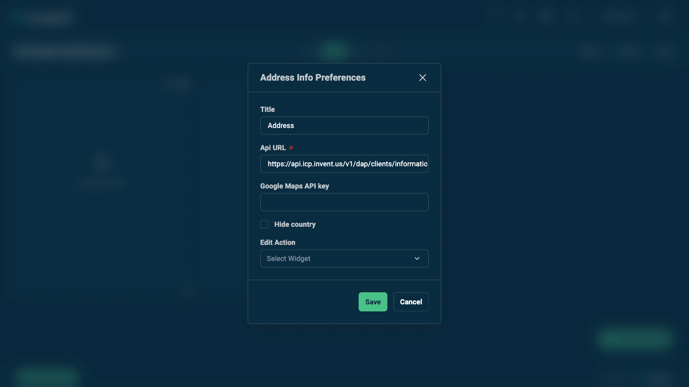 Address Info widget settings interface example showing the configuration panel in the Dashboard Composer (Host application)
Widget Settings Component
src/widget/widget-settings.tsx:
import React from "react";
import type { IWidgetProps } from "../types/widget-props";

interface ISettingsProps extends IWidgetProps {
  onSettingsChange: (settings: any) => void;
}

const KpiTrackerSettings: React.FC<ISettingsProps> = ({
  title,
  apiUrl,
  refreshInterval,
  onSettingsChange,
  httpClient,
}) => {
  // For formType: "json", the form is auto-generated from jsonSchema
  // For formType: "customized" or "dedicated", implement custom UI

  return (
    <div>
      {/* Custom settings UI if needed */}
      <p>Settings are managed via JSON Schema form</p>
    </div>
  );
};

export default KpiTrackerSettings;
Advanced Settings Schema
{
  "settingsSchema": {
    "title": "Advanced KPI Tracker Settings",
    "uiSchema": {
      "ui:order": [
        "title",
        "titleTooltip",
        "apiUrl",
        "refreshInterval",
        "metrics",
        "thresholds",
        "displayOptions"
      ],
      "title": {
        "ui:widget": "InputWidget",
        "ui:options": {
          "placeholder": "Enter widget title"
        }
      },
      "titleTooltip": {
        "ui:widget": "InputWidget",
        "ui:options": {
          "placeholder": "Tooltip shown on hover"
        }
      },
      "apiUrl": {
        "ui:widget": "InputWidget",
        "ui:options": {
          "placeholder": "https://api.example.com"
        }
      },
      "refreshInterval": {
        "ui:widget": "InputWidget",
        "ui:options": {
          "inputType": "number"
        }
      },
      "metrics": {
        "ui:widget": "CheckboxesWidget",
        "ui:options": {}
      },
      "thresholds": {
        "revenue": {
          "ui:widget": "InputWidget",
          "ui:options": {
            "inputType": "number"
          }
        }
      },
      "displayOptions": {
        "showTrend": {
          "ui:widget": "CheckboxWidget",
          "ui:options": {}
        },
        "enableNotifications": {
          "ui:widget": "CheckboxWidget",
          "ui:options": {}
        },
        "chartType": {
          "ui:widget": "SelectWidget",
          "ui:options": {}
        }
      }
    },
    "jsonSchema": {
      "type": "object",
      "required": ["apiUrl", "refreshInterval"],
      "properties": {
        "title": {
          "type": "string",
          "title": "Widget Title",
          "default": "KPI Tracker",
          "maxLength": 50
        },
        "titleTooltip": {
          "type": "string",
          "title": "Title Tooltip",
          "maxLength": 200
        },
        "apiUrl": {
          "type": "string",
          "title": "API URL",
          "default": "_internal_api_",
          "pattern": "^https?://.*"
        },
        "refreshInterval": {
          "type": "number",
          "title": "Refresh Interval (seconds)",
          "default": 30,
          "minimum": 10,
          "maximum": 300
        },
        "metrics": {
          "type": "array",
          "title": "Metrics to Display",
          "items": {
            "type": "string",
            "enum": ["revenue", "users", "conversion", "churn", "ltv"]
          },
          "uniqueItems": true,
          "default": ["revenue", "users", "conversion"]
        },
        "thresholds": {
          "type": "object",
          "title": "Alert Thresholds",
          "properties": {
            "revenue": {
              "type": "number",
              "title": "Revenue Threshold",
              "default": 10000
            },
            "users": {
              "type": "number",
              "title": "Users Threshold",
              "default": 1000
            },
            "conversion": {
              "type": "number",
              "title": "Conversion Rate Threshold (%)",
              "default": 2.5,
              "minimum": 0,
              "maximum": 100
            }
          }
        },
        "displayOptions": {
          "type": "object",
          "title": "Display Options",
          "properties": {
            "showTrend": {
              "type": "boolean",
              "title": "Show Trend Indicators",
              "default": true
            },
            "enableNotifications": {
              "type": "boolean",
              "title": "Enable Notifications",
              "default": false
            },
            "chartType": {
              "type": "string",
              "title": "Chart Type",
              "enum": ["line", "bar", "area"],
              "default": "line"
            }
          }
        }
      }
    },
    "extraErrors": {},
    "formType": "json"
  }
}
Using Settings in Widget
Settings configured in the Dashboard Composer (Host application) are passed as individual props to the widget component:
const KpiTracker: React.FC<IWidgetProps> = ({
  title,
  apiUrl,
  refreshInterval,
  metrics,
  displayOptions,
  showTrend,
}) => {
  // Access settings directly as props
  const metricsToDisplay = metrics || ["revenue", "users"];
  const showTrendIndicators = displayOptions?.showTrend ?? showTrend ?? true;

  // Use settings in logic
  useEffect(() => {
    const interval = setInterval(() => {
      fetchData();
    }, refreshInterval * 1000);

    return () => clearInterval(interval);
  }, [refreshInterval]);

  return (
    <div>
      <h2>{title}</h2>
      {metricsToDisplay.includes("revenue") && <RevenueMetric />}
      {metricsToDisplay.includes("users") && <UsersMetric />}
      {showTrendIndicators && <TrendIndicators />}
    </div>
  );
};
Implementing Widget Preview
Widget preview is displayed in the Dashboard Composer (Host application) when users add widgets to dashboards.
Widget Preview Component
The preview component should be an SVG React component for optimal performance and scalability.
src/widget-preview/widget-preview.tsx:
import React, { SVGProps } from "react";
import styled from "styled-components";

function KpiTrackerPreview(props: SVGProps<SVGSVGElement>) {
  return (
    <Svg
      width="88"
      height="64"
      viewBox="0 0 88 64"
      xmlns="http://www.w3.org/2000/svg"
      {...props}
    >
      {/* Header */}
      <rect x="4" y="4" width="80" height="8" rx="2" fill="#13B7D1" />

      {/* KPI Cards */}
      <rect x="4" y="16" width="25" height="20" rx="2" fill="#EDF5FA" />
      <rect x="32" y="16" width="25" height="20" rx="2" fill="#EDF5FA" />
      <rect x="60" y="16" width="24" height="20" rx="2" fill="#EDF5FA" />

      {/* Card labels */}
      <rect
        x="7"
        y="19"
        width="19"
        height="3"
        rx="1"
        fill="#204E6E"
        opacity="0.6"
      />
      <rect
        x="35"
        y="19"
        width="19"
        height="3"
        rx="1"
        fill="#204E6E"
        opacity="0.6"
      />
      <rect
        x="63"
        y="19"
        width="19"
        height="3"
        rx="1"
        fill="#204E6E"
        opacity="0.6"
      />

      {/* Card values */}
      <rect x="7" y="25" width="18" height="5" rx="1" fill="#13B7D1" />
      <rect x="35" y="25" width="18" height="5" rx="1" fill="#13B7D1" />
      <rect x="63" y="25" width="16" height="5" rx="1" fill="#13B7D1" />

      {/* Trend indicators */}
      <rect x="7" y="32" width="10" height="2" rx="1" fill="#0CA660" />
      <rect x="35" y="32" width="10" height="2" rx="1" fill="#0CA660" />
      <rect x="63" y="32" width="10" height="2" rx="1" fill="#F33309" />

      {/* Footer */}
      <rect
        x="4"
        y="42"
        width="40"
        height="3"
        rx="1"
        fill="#204E6E"
        opacity="0.4"
      />
    </Svg>
  );
}

const Svg = styled.svg`
  display: block;
`;

export default KpiTrackerPreview;
Alternative: Image Preview
Widgets can also display a preview using an image URL specified in widget-config.json:
{
  "widgetDetails": {
    "title": "KPI Tracker",
    "type": "Informer",
    "description": "Displays key performance indicators",
    "customLogo": "https://example.com/path/to/preview-image.png"
  }
}
When customLogo is provided, it will be used instead of the SVG preview component in the Micro App Library.
Next Steps
Continue to: Core Features →