Dashboard Integration
This section covers how widgets integrate with the platform's Dashboard Composer and how to build your main widget component.
Understanding Widget Types
Reference:
The platform supports three types of widgets, each serving different purposes:
Dashboard Widgets (Type 1)
Dashboard widgets are the most common type of widget. They are displayed on dashboards and make up the main part of business applications. Each dashboard widget is a single-page application (SPA) that can:
- Display data and visualizations
- Interact with APIs
- Share state with other widgets on the dashboard
- Use the platform's theming system
- Be configured through widget settings
Examples: KPI Tracker, Chart widgets, Data tables, Analytics widgets
This tutorial focuses on building Dashboard widgets.
Platform Widgets (Type 0)
Platform widgets are structural components outside of the dashboard space that manage core platform functionality. They can:
- Manage navigation within the platform (side navigation, main menu)
- Handle authentication flows (login screens)
- Provide system-level UI components (notifications, error screens)
- Control access to features (role-based access wrappers)
- Manage platform initialization (user info, theme settings)
Platform widgets are identified by domain and placement properties and are typically created by platform developers rather than widget developers.
Examples: Side navigation, Login screen, Notification system, Error pages
Learn more: Platform Widgets Documentation
Universal Widgets (Type 2)
Universal widgets can function both as Dashboard widgets and Platform widgets. They are less common and used for special cases where a widget needs to serve both purposes.
Widget Type Configuration
The widget type is configured in widget-config.json:
{
  "widgetDetails": {
    "name": "KpiTracker",
    "id": "kpi-tracker",
    "port": 5123,
    "widgetType": 1,
    ...
  }
}
widgetType values:
0- Platform widget1- Dashboard widget (most common)2- Universal widget
Reference: Widget Store Migrations - Complete widgetType enum documentation
Dashboard Composer and Micro App Library
The Dashboard Composer (within the Host application) is the interface where new widgets (called Micro Apps within the platform) are added to dashboards, widget settings are configured, and UI positions are set.
Adding Widgets to Dashboard
- Open the Dashboard Composer in the Host application
- Click the "Add micro app" button to open the Micro App Library
- Browse or search for widgets in the Micro App Library
- Select a widget to add it to your dashboard
- Configure widget settings through the settings panel
- Position and resize the widget using drag-and-drop
Dashboard Composer Interface
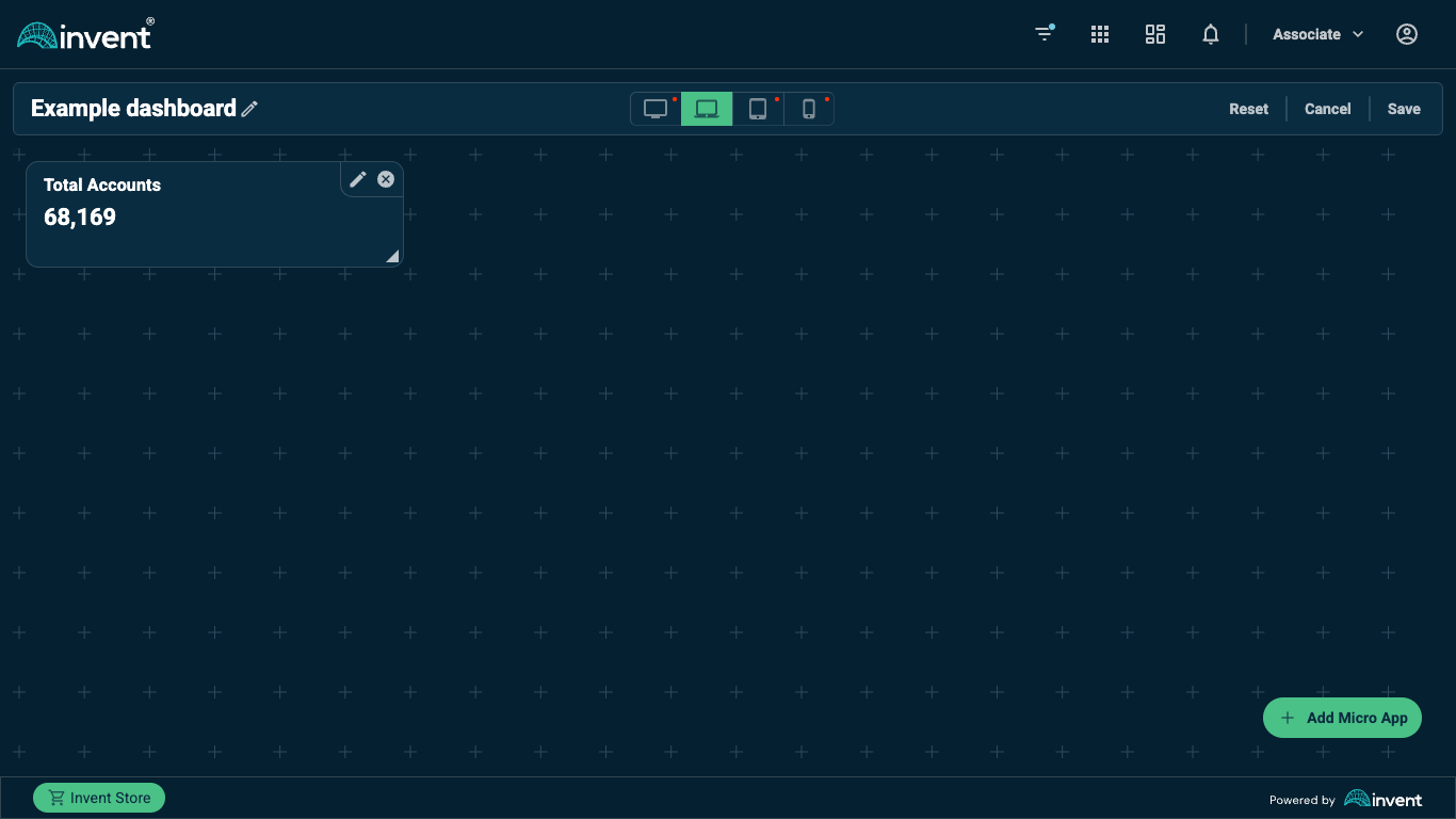 Dashboard Composer interface showing widget placement and configuration
Micro App Library
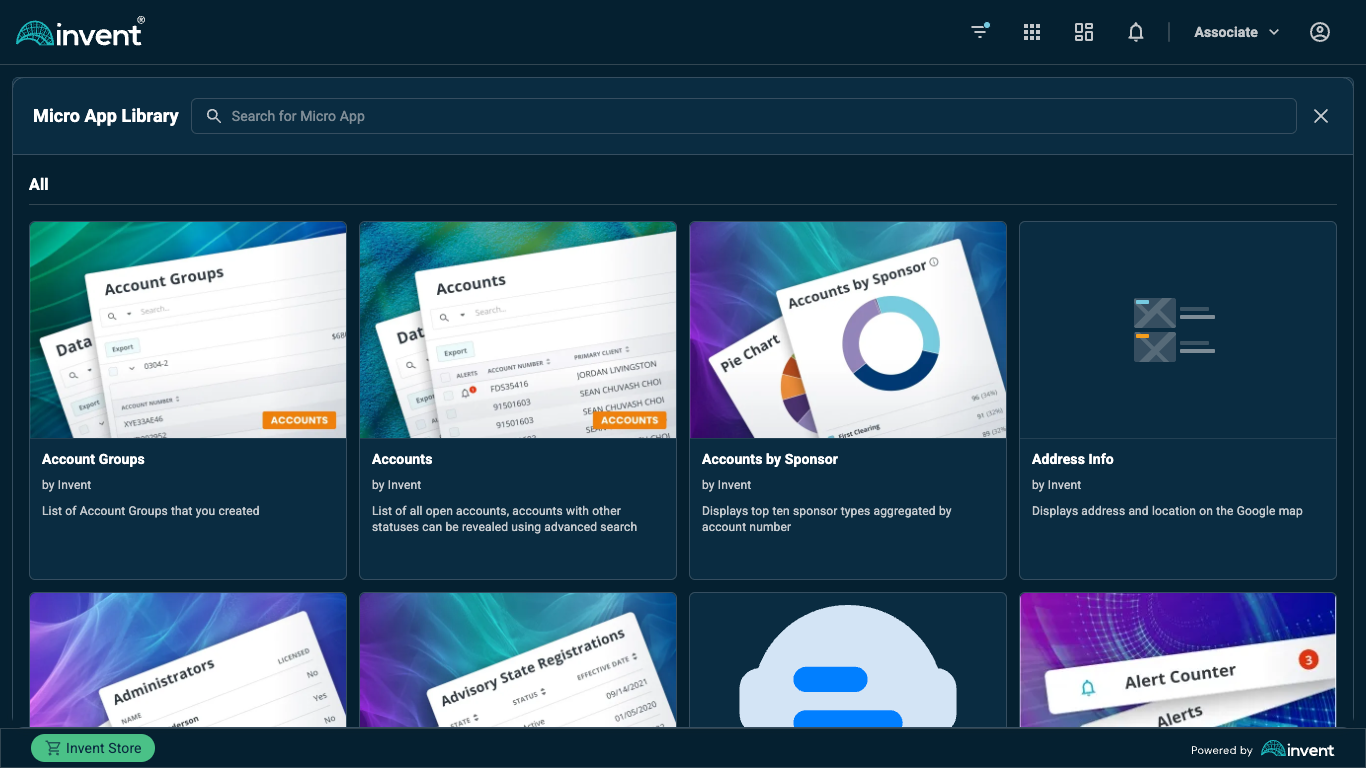 Micro App Library showing available widgets filtered by context rules
The Micro App Library displays widgets that are available based on the current dashboard's URL parameters and each widget's context rules (configured in widget-config.json). Widgets that don't meet the context requirements will not appear in the library.
Learn more about context rules in: Configuration → Configuring Widget Metadata
Widget Presets (Derived Micro Apps)
What are Presets?
Widgets (also called Micro Apps within the platform) can have preconfigured settings called Presets or Derived Micro Apps. A preset is a widget settings configuration that is preconfigured in the ICP (Invent Control Panel) for a specific portal page.
Creating a Preset
To create a preset (derived micro app):
- Open the ICP (Invent Control Panel)
- Navigate to the desired portal page
- Go to the Micro Apps page
- In the micro apps list, click the three-dotted icon (⋮) at the end of the row
- Select "Create derived micro app"
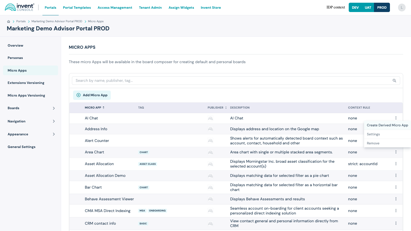 Creating a derived micro app in the ICP interface
- Configure the preset settings
- Save the preset
Using Presets
Once created, the preset will be listed in the Micro App Library within the Dashboard Composer. Users can add preconfigured widgets to their dashboards without manually setting up each configuration option.
Presets are especially useful for:
- Standard configurations used across multiple dashboards
- Complex settings that should be consistent
- Quick deployment of commonly used widget configurations
- Reducing configuration errors
For programmatic access to presets, see: Advanced Features → Preset Extension
Building the Main Widget Component
Widget Props Interface
Reference: Widget Specifications API
Create a TypeScript interface for your widget props:
src/types/widget-props.ts:
import type {
  HttpClientT,
  IPlatformMeta,
  UseShareValueT,
  UseSelectSharedValueT,
  UseDeleteSharedValueT,
  RemoteModuleT,
  ShowNotificationT,
  UseQueryDataT,
  UseDashboardNavigationInfoT,
} from "@invent/shared-types";

export interface IWidgetProps {
  // Platform meta information
  platformMeta: IPlatformMeta;

  // HTTP client for API calls
  httpClient: HttpClientT;

  // State sharing hooks
  useShareValue: UseShareValueT;
  useSelectSharedValue: UseSelectSharedValueT;
  useDeleteSharedValue: UseDeleteSharedValueT;

  // Widget settings (individual props, not grouped)
  title: string;
  titleTooltip?: string;
  apiUrl: string;
  refreshInterval: number;
  showTrend: boolean;
  enableNotifications: boolean;

  // Remote module rendering
  remoteModule: RemoteModuleT;

  // Notifications
  showNotification: ShowNotificationT;

  // React Query integration
  useQueryData: UseQueryDataT;

  // Dashboard navigation
  useDashboardNavigationInfo: UseDashboardNavigationInfoT;

  // Extensions
  getExtension: (name: string) => any;
  installedExtensions: any[];

  // Layout props
  layout?: {
    w: number;
    h: number;
    x: number;
    y: number;
  };

  // Widget instance ID
  dashboardWidgetInstanceId: string;
}
IPlatformMeta Interface
Reference: @invent/shared-types
interface IPlatformMeta {
  storeWidgetsById: Record<string, IWidgetMetadata<Record<string, unknown>>>;
  platformWidgetsById: Record<string, IPlatformWidget>;
  currentDashboardId?: string;
  currentDashboard: IDashboard | undefined;
}
Main Widget Component Example
src/widget/widget.tsx:
import React, { useState, useEffect, useMemo } from "react";
import styled from "styled-components";
import { useQuery } from "react-query";
import { path } from "ramda";
import type { ISharedState } from "@invent/shared-types";
import {
  getColor,
  getSizeBy,
  getFontFamily,
  getTypography,
  getElevation,
} from "@invent/wl-ui-kit";
import { ProxyApp } from "@invent/proxy-app-components";
import type { IWidgetProps } from "../types/widget-props";

// Shared state selector
function kpiDataSelector(state: ISharedState) {
  return path<IKpiData | undefined>(["kpiData"], state);
}

// KPI data interface
interface IKpiData {
  revenue: number;
  users: number;
  conversion: number;
  timestamp: number;
}

const KpiTracker: React.FC<IWidgetProps> = ({
  platformMeta,
  httpClient,
  useShareValue,
  useSelectSharedValue,
  useDeleteSharedValue,
  title,
  titleTooltip,
  apiUrl,
  refreshInterval,
  showTrend,
  enableNotifications,
  remoteModule,
  showNotification,
  useQueryData,
  useDashboardNavigationInfo,
  getExtension,
  installedExtensions,
  layout,
  dashboardWidgetInstanceId,
}) => {
  // State management
  const shareValue = useShareValue();
  const sharedKpiData = useSelectSharedValue(kpiDataSelector);
  const [localKpiData, setLocalKpiData] = useState<IKpiData | null>(null);

  // OAuth authentication with ProxyApp
  return (
    <ProxyApp
      httpClient={httpClient}
      provider="kpiProvider"
      authUrl={apiUrl}
      instanceName="kpi-tracker"
    >
      <KpiTrackerContent
        shareValue={shareValue}
        sharedKpiData={sharedKpiData}
        localKpiData={localKpiData}
        setLocalKpiData={setLocalKpiData}
        httpClient={httpClient}
        apiUrl={apiUrl}
        refreshInterval={refreshInterval}
        showTrend={showTrend}
        enableNotifications={enableNotifications}
        title={title}
        titleTooltip={titleTooltip}
        showNotification={showNotification}
        getExtension={getExtension}
        dashboardWidgetInstanceId={dashboardWidgetInstanceId}
      />
    </ProxyApp>
  );
};

// Widget content component (wrapped by ProxyApp)
const KpiTrackerContent: React.FC<any> = ({
  shareValue,
  sharedKpiData,
  localKpiData,
  setLocalKpiData,
  httpClient,
  apiUrl,
  refreshInterval,
  showTrend,
  enableNotifications,
  title,
  titleTooltip,
  showNotification,
  getExtension,
  dashboardWidgetInstanceId,
}) => {
  // Get KPI data
  const kpiEndpoint = `${apiUrl}/kpi`;
  const {
    data: kpiData,
    refetch,
    isLoading,
    error: queryError,
  } = useQuery<IKpiData>(
    [kpiEndpoint, dashboardWidgetInstanceId],
    async () => {
      if (apiUrl) {
        return await httpClient(kpiEndpoint, {
          traceId: `kpi-tracker-${dashboardWidgetInstanceId}`,
        });
      }
      return null;
    },
    {
      refetchInterval: refreshInterval * 1000,
      enabled: !!apiUrl,
    }
  );

  // Update shared state when data changes
  useEffect(() => {
    if (kpiData) {
      shareValue(["kpiData"], kpiData);
      setLocalKpiData(kpiData);
    }
  }, [kpiData, shareValue]);

  // WebSocket integration for real-time updates
  useEffect(() => {
    const wsExt = getExtension("@invent/bff-ws-ext");
    const subscriptionId = `kpi-${dashboardWidgetInstanceId}`;

    if (wsExt && wsExt.subscribe) {
      wsExt.subscribe("KpiUpdate", subscriptionId, (message: any) => {
        const updatedKpi = message.message;
        setLocalKpiData(updatedKpi);
        shareValue(["kpiData"], updatedKpi);

        if (enableNotifications) {
          showNotification("info", "KPI data updated", {
            position: "bottom-right",
            autoClose: 3000,
          });
        }
      });
    }

    return () => {
      if (wsExt && wsExt.unsubscribe) {
        wsExt.unsubscribe("KpiUpdate", subscriptionId);
      }
    };
  }, [getExtension, dashboardWidgetInstanceId, enableNotifications]);

  // Handle errors
  useEffect(() => {
    if (queryError) {
      showNotification("error", "Failed to load KPI data", {
        position: "top-center",
        autoClose: 5000,
      });
    }
  }, [queryError, showNotification]);

  // Loading state
  if (isLoading) {
    return (
      <WidgetContainer>
        <LoadingText>Loading KPI data...</LoadingText>
      </WidgetContainer>
    );
  }

  const displayData = localKpiData || sharedKpiData;

  return (
    <WidgetContainer>
      <WidgetHeader>
        <WidgetTitle title={titleTooltip}>{title}</WidgetTitle>
      </WidgetHeader>

      <KpiGrid>
        <KpiCard>
          <KpiLabel>Revenue</KpiLabel>
          <KpiValue>${displayData?.revenue.toLocaleString()}</KpiValue>
          {showTrend && <TrendIndicator trend="up">↑ 12%</TrendIndicator>}
        </KpiCard>

        <KpiCard>
          <KpiLabel>Users</KpiLabel>
          <KpiValue>{displayData?.users.toLocaleString()}</KpiValue>
          {showTrend && <TrendIndicator trend="up">↑ 8%</TrendIndicator>}
        </KpiCard>

        <KpiCard>
          <KpiLabel>Conversion</KpiLabel>
          <KpiValue>{displayData?.conversion.toFixed(2)}%</KpiValue>
          {showTrend && <TrendIndicator trend="down">↓ 3%</TrendIndicator>}
        </KpiCard>
      </KpiGrid>

      <LastUpdate>
        Last updated:{" "}
        {displayData?.timestamp
          ? new Date(displayData.timestamp).toLocaleTimeString()
          : "N/A"}
      </LastUpdate>
    </WidgetContainer>
  );
};

// Styled components
const WidgetContainer = styled.div`
  display: flex;
  flex-direction: column;
  height: 100%;
  padding: ${getSizeBy(3)};
  background-color: ${getColor("surface")};
  border-radius: ${(props) => props.theme.borderRadius}px;
  box-shadow: ${getElevation(1)};
  font-family: ${getFontFamily("primary")};
`;

const WidgetHeader = styled.div`
  margin-bottom: ${getSizeBy(2)};
`;

const WidgetTitle = styled.h2`
  ${getTypography("Heading2")};
  color: ${getColor("onSurface")};
  margin: 0;
`;

const KpiGrid = styled.div`
  display: grid;
  grid-template-columns: repeat(auto-fit, minmax(150px, 1fr));
  gap: ${getSizeBy(2)};
  flex: 1;
`;

const KpiCard = styled.div`
  display: flex;
  flex-direction: column;
  padding: ${getSizeBy(2)};
  background-color: ${getColor("tertiary")};
  border-radius: ${(props) => props.theme.borderRadius}px;
  transition: transform 0.2s;

  &:hover {
    transform: translateY(-2px);
    box-shadow: ${getElevation(2)};
  }
`;

const KpiLabel = styled.div`
  ${getTypography("Caption")};
  color: ${getColor("secondary")};
  margin-bottom: ${getSizeBy(1)};
`;

const KpiValue = styled.div`
  ${getTypography("Heading1")};
  color: ${getColor("primary")};
  margin-bottom: ${getSizeBy(1)};
`;

const TrendIndicator = styled.div<{ trend: "up" | "down" }>`
  ${getTypography("Caption")};
  color: ${(props) =>
    props.trend === "up" ? getColor("success") : getColor("danger")};
`;

const LastUpdate = styled.div`
  ${getTypography("Caption")};
  color: ${getColor("onSurface", "mediumEmphasis")};
  margin-top: ${getSizeBy(2)};
  text-align: right;
`;

const LoadingText = styled.div`
  ${getTypography("Body1")};
  color: ${getColor("onSurface")};
  text-align: center;
  padding: ${getSizeBy(4)};
`;

export default KpiTracker;